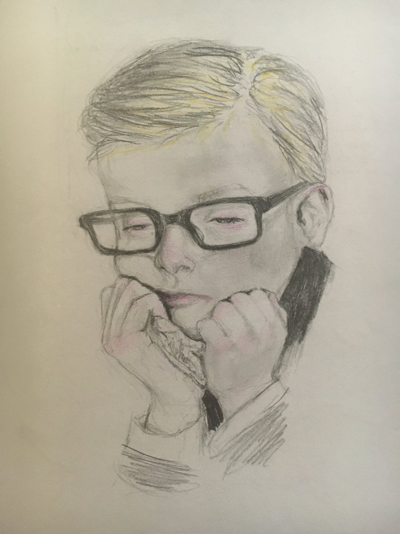
  The career that I am looking into for my college applications is Art Conservation. This field of study entails working on past art pieces to improve the condition by stabilizing physical condition and repairing disfigurement arising from deterioration or general damage from age or external factors. To get into this field, one would need to get into a graduate conservation program in conservation and proceed to complete apprenticeships and internships with museums and other programs. There are not many colleges that provide graduate programs, the few that do are University of Delaware, Buffalo State College, Columbia University, Harvard University, New York University IFA, Queen’s University,University of California (Los Angeles/Getty), and University of Pennsylvania. In order to get into these graduate programs, a major in art history is really helpful. However, most programs just require that certain hours of credits be reached for certain programs. These classes can include art history, chemistry, and studio art. There are some additional requirements, such as the GRE test obviously, and certain GPA minimums. Some of the top programs in conservation are provided by University of Delaware and Buffalo State College.
0 Comments
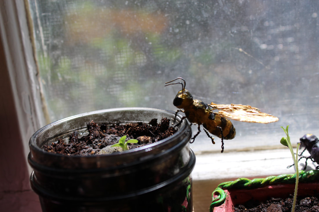
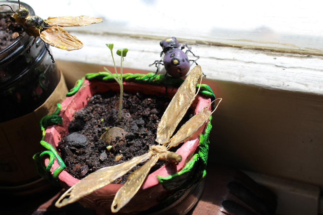
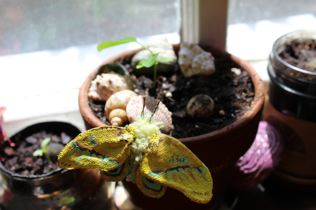
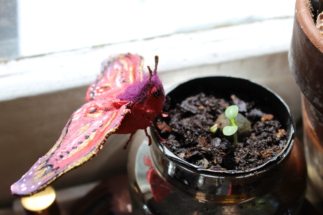
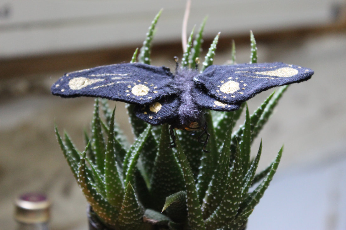
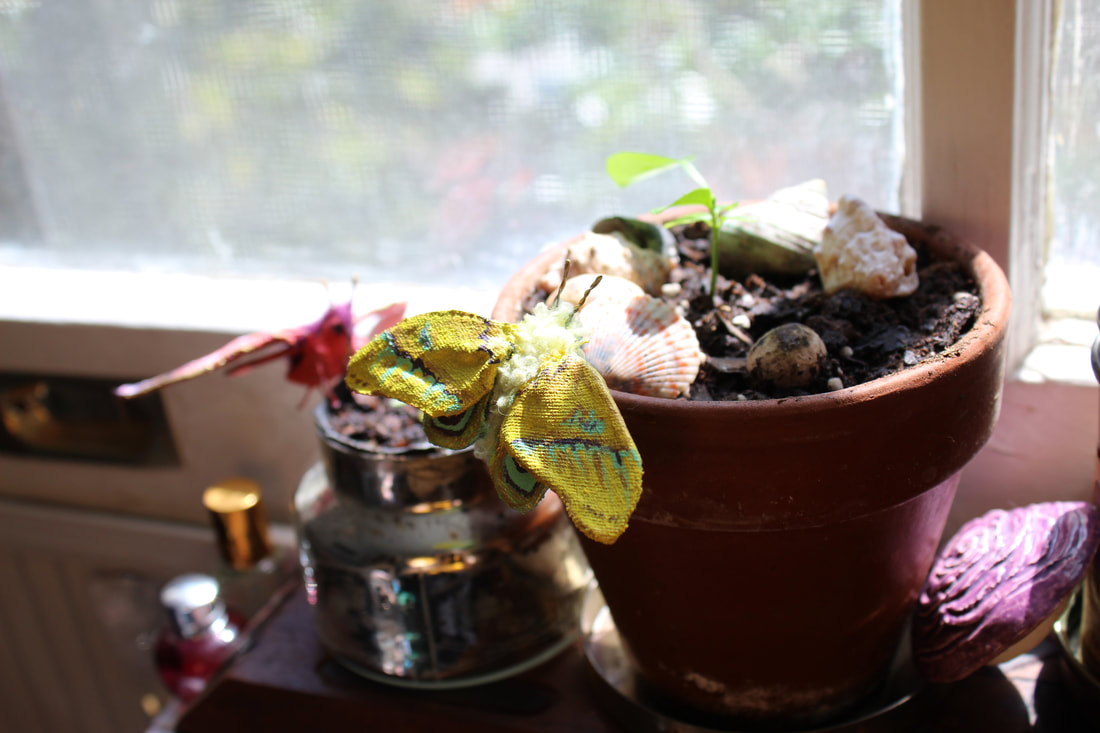
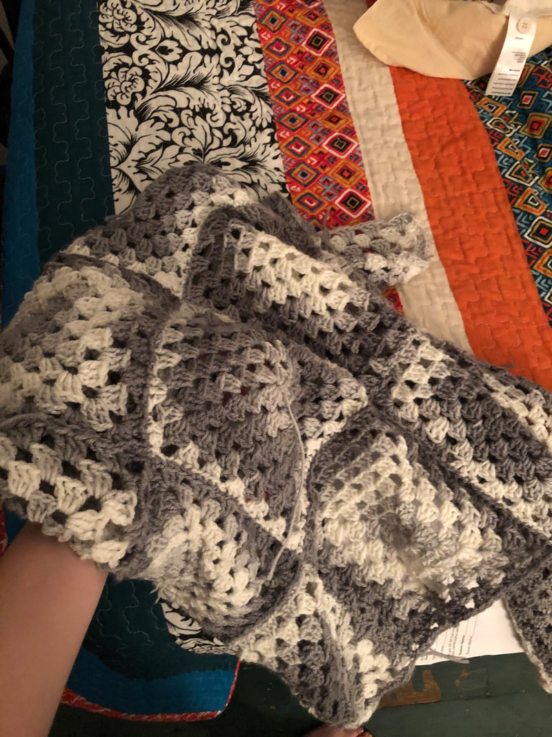
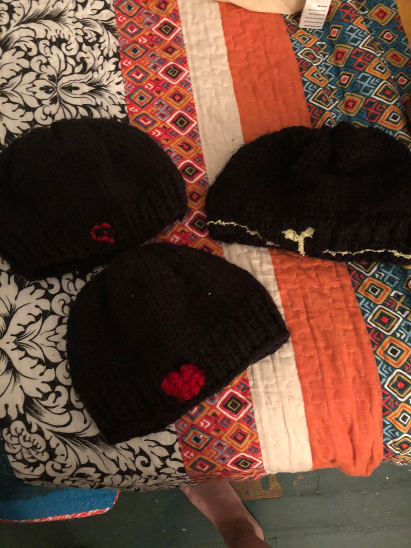
"Fantastical Bugs"I got really into gardening and nature in general this summer and became intrigued with certain bugs. These were made with sculpey clay, metal wire, acrylic paint, and some had cloth for the wings while some had plastic wrap. Collage SeriesOver quarantine, I also went through a magazine phase in which I was sucked into the amazing photography in Nat Geo and Madame. I made use of this by creating art with the pictures I loved. I made it a goal to fill this little notebook with collages and I was successful! I had a lot of fun with it and it made me realize that I want to incorporate collage work into my projects more often. (the first collage was in the beginning of quarantine and is a comment on the whole situation with the race to find a vaccine and the new regulations in place) Yarn.One of the many things I learned in our time off was how to knit and crochet! Here is a blanket that I have been working on as well as a sample of the MANY hats that I made. I made so many hats that I considered selling them, but I think I have settled on donating them to homeless people who need them (especially during this whole pandemic). Overall, I was a lot busier during quarantine than I thought! I did all this art in my spare time from work and college searching, which actually helped me strengthen my passion for art after spending most of my creative time making art for assignments (which is fun, but when there are rules/guidelines for some reason it makes me do art just to get it done with rather than because I want to be creative/express myself). I posted some more little stuff on my Instagram over quarantine, so below is the link.
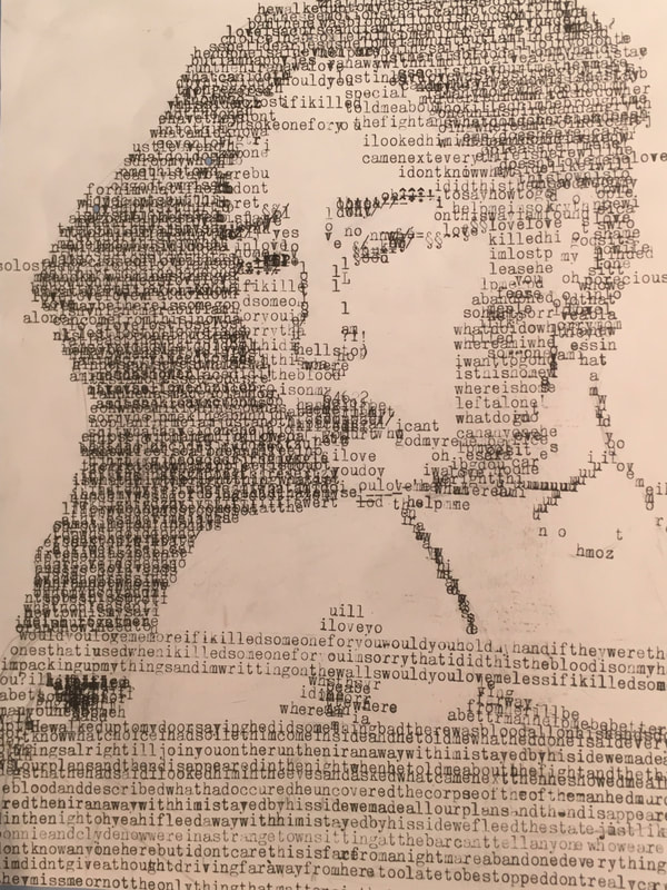
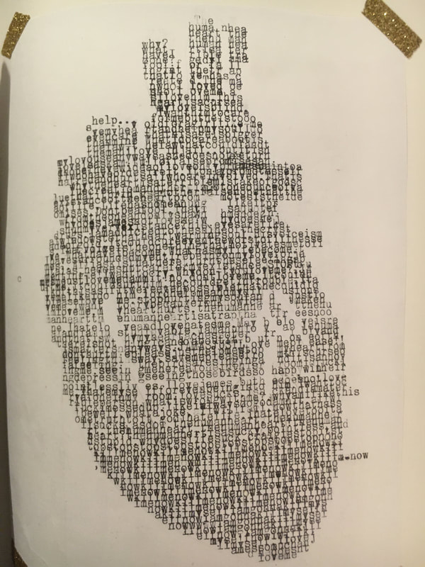
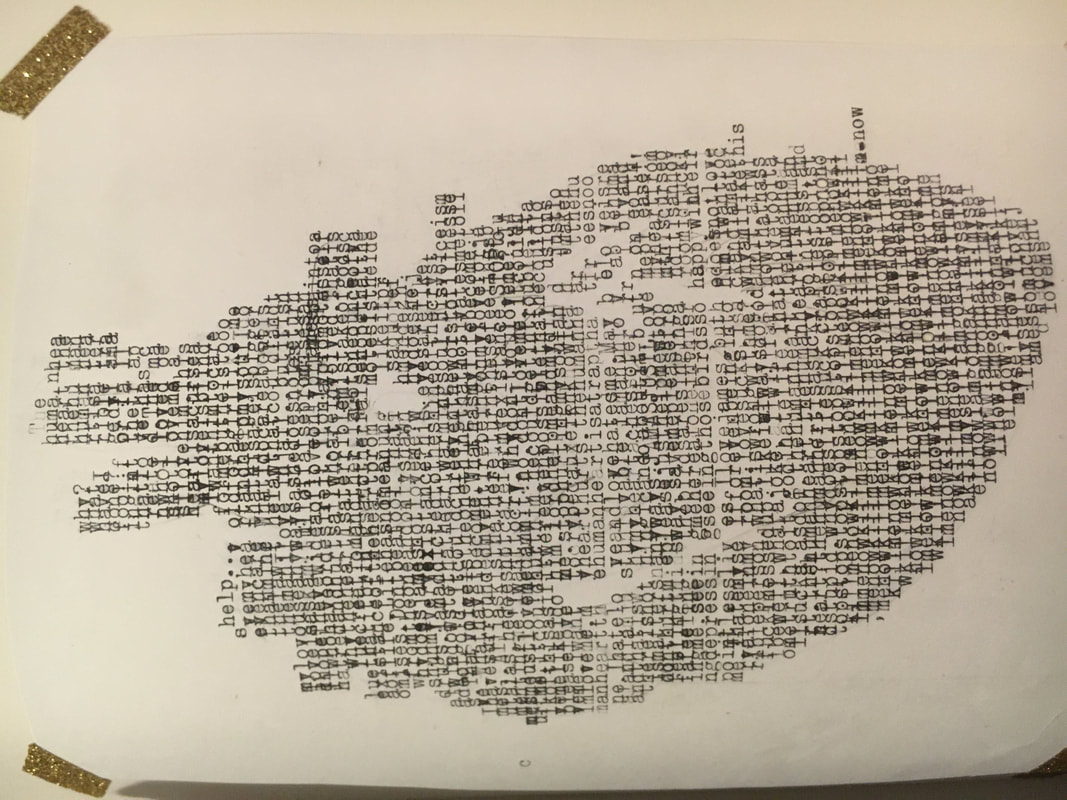
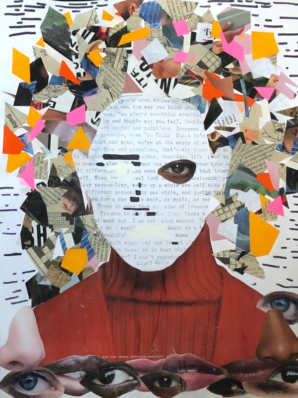 The theme of this piece is portraiture, however it is expressed differently from my past pieces that were more literal as I wanted to step back from what I am familiar with. Using magazine cutouts and my typewriter, I expressed all the elements that make up a person/portrait in a way that creates the implication of a portrait.
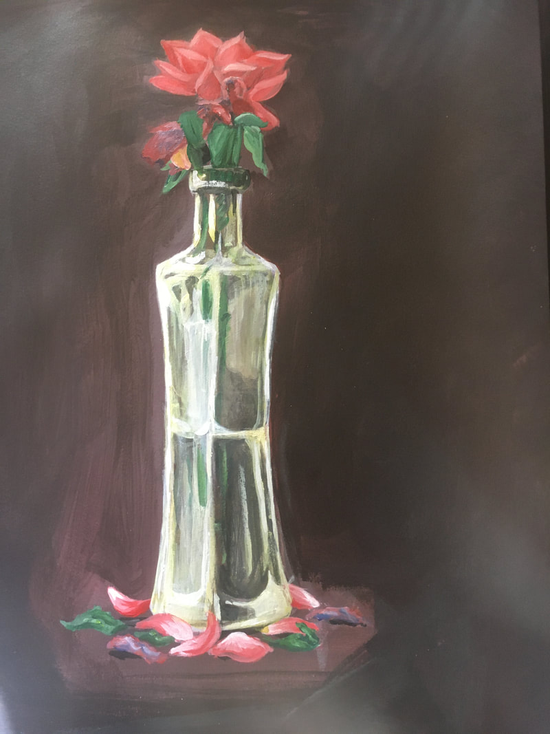
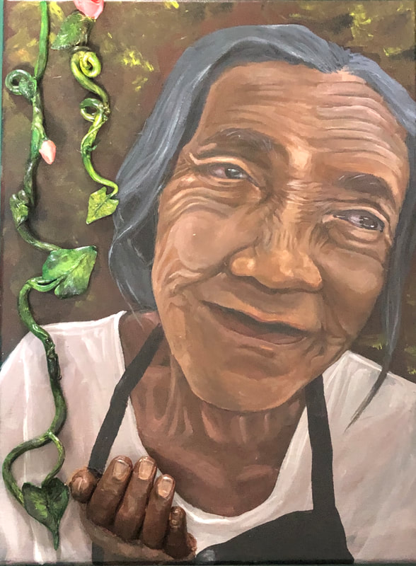 This piece is representative of the cycles of life through the concept of aging in humans and the growth of plants. The woman reaches through the canvas as an old woman with her hand out to support the growth of new, young life.
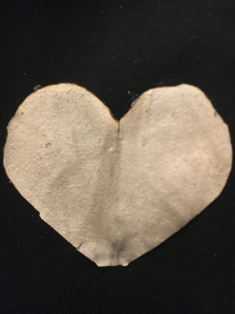
Today I finished all of my projects for the Fantastic Four assignment. The two head projects were based on the theme of "life" and they are the plant pot sculpture and the painting of the flowers. The pot is both a carrier of new life (sprouting plants) and made up of old life (the old woman). The painting also plays with the concept of life (and also death) with the plant in water and the falling petals. There are also dead flowers littered among the painting to signify the end of life. My two heart projects share the subject of portraiture. One was made using a typewriter and the other is made of paper (magazine and card stock). The typewriter portrait is made up of words from different song lyrics (with a few typos). The final piece is a self-portrait made up of Nat Geo pages and card stock. Ironically they were about Leonardo DaVinci and humans.
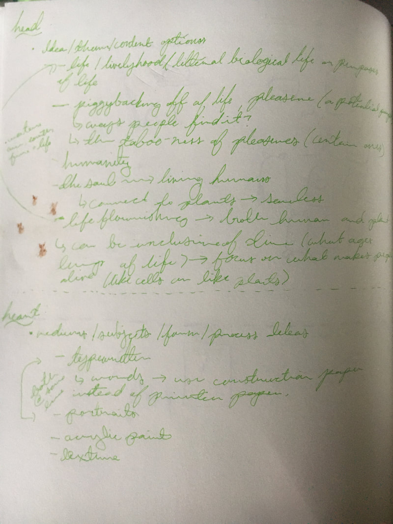
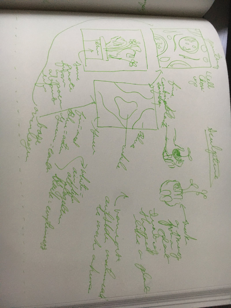
I have settled on the theme of life for the head part of the assignment and portraiture as the subject and a typewriter as the medium of the hear part of the project. I have included pictures of my notes and some thumbnail sketches for potential projects as well. I want to make a painting of a plant with cell patterns and the colors of water, air, earth, and fire/light as my background to portray life in a unique way for my first head piece. My second head piece will be a sculpture of some sort that can function as a plant pot. I haven't settled on a design yet. For my heart project, I want to use words from song lyrics or something like that to make a portrait similar to the way I made the heart, though this time I want to play with layering the words to create shadows and more variance in values.
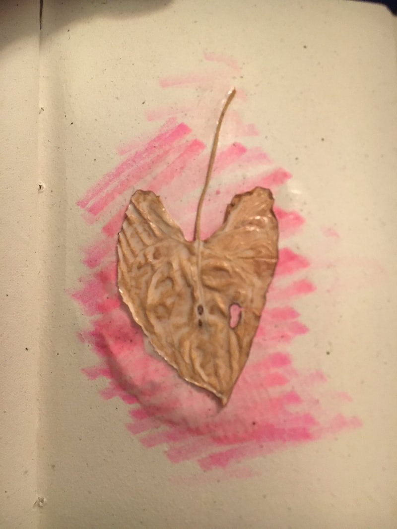
This quarter has certainly been interesting and so has my journey with the play pages. Some of my favorite mediums to use to create my play pages were the typewriter and the clay. One of the themes that I noticed that branched out of the heart concept was life. This is a theme that I would like to use for the brain part of the fantastic four projects, maybe focusing on the literal aspect like cells (indicate a living organism) or a more abstract concept, for example the elements necessary for life to exist. For the hearts part of the project, I wanted to use my typewriter to make a piece because it was my favorite medium and I think I could do something pretty cool with it. The subject I want to use is people, focusing or portraiture. I noticed, when looking back in my sketchbook, that I tend to do a lot of portraits, so I want to make something cool with it. After this week's play page works, I now I have numerous cuts on my finger. That is because this week I was experimenting with light, negative space, and pocketknives. On day 1, after finishing a full box of Cheez-Its , I decided to cut the box to create my heart form. After finishing, It looked like it was lacking something, so i tried putting my Christmas lights in it and it turned out looking pretty cool. The second day I wanted to try it with a coke can, but originally I was planning to cop out and just cut out a typical cartoon heart. However, I was feeling adventurous so I cut out the full human heart farm using a pocketknife and then I decided to do the same as the previous day and add the lights inside of the can. Though I ended up cutting my hands quite a bit, I thought the end result is one of the coolest that I have made yet, and I also kind of wish I had made a ton of them so I could make a string of Coca-Cola can lights. On the third day, I used my scraps from the first two days an recreated the heart form (pretty average). On the fourth day I got back into playing with light and I used some red leaves and the sun to make the heart, but I had a really hard time keeping them together with glue. If I did it again I would probably try using a different adhesive. The last two images are of the fifth day, which I had some fun with. I found some really tiny canvases in my drawer, so I cut out of it like with the first two pieces, but this time, I tried putting the color on the back of the canvas and using the sunlight to reflect it. After a few failed attempts to notice the color, I figured it might be cool to draw on the back of the paper and let the light of the sun shine it through. The first picture is what I intended on it looking like, but the second one was taken because I noticed the shadow the canvas made looked really cool too. Overall, I had fun experimenting this week, though maybe next week I'll take a break from sharp objects.
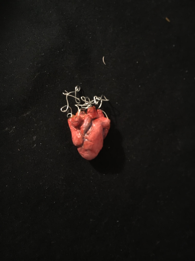
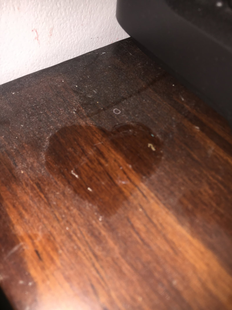
Late update of my play pages! The first week of not being in school was hard, but I had a lot of chances to create play pages. On the first day I fixed my old typewriter, so I decided to make some art with it! This one is probably my favorite play page so far. On the second day, I accidentally killed my plant, but noticed it was heart shaped so I pasted it in a sketchbook! On the third day, I was cleaning my room and found that there was a lot of dust all over my cabinets, so I didn't want the dust to go to waste and I drew a pretty little heart in it and took a cool picture of it. The fourth day, I burned some paper (I did't take a very good picture) by drawing a heart with water and burning the paper until the fire went out when it reached the water-soaked area. The last day, I made a heart out of clay and wire and painted with acrylic paint. I'll post this weeks play pages at the end of the day on Friday!
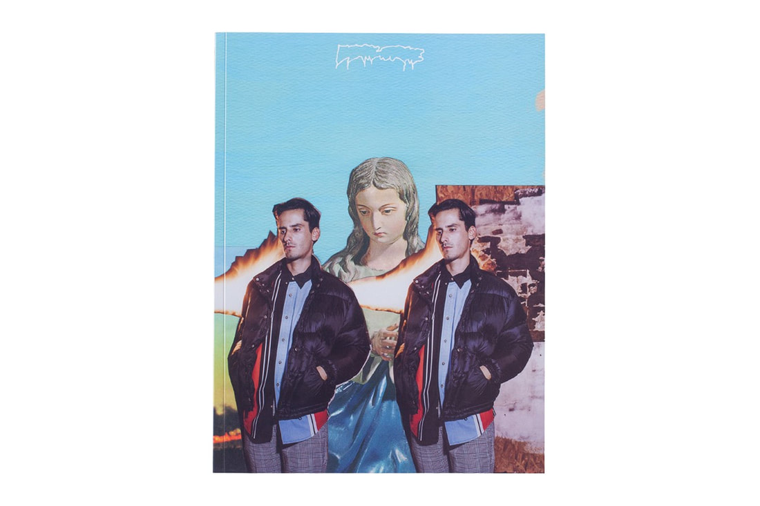
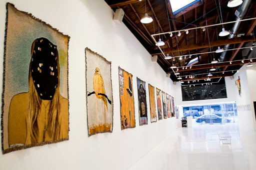
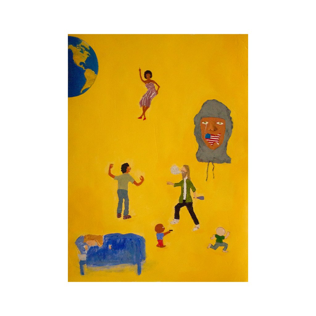
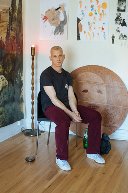 Jason Dill (b. 1976 ) Jason Dill , born in Huntington Beach, California, is a pro-skater and entrepreneur that has transformed the skating culture and community immensely throughout his career. Putting an emphasis on design and aesthetic with his skateboards and skate-wear, Dill has managed to combine the art and skate world with his edgy and intriguing style. Though he has had only one true gallery exhibit at a place called the Known Gallery in Los Angeles (bottom image) , Dills work can be seen all over. His boards on which his art can be most seen are sold to skaters all over the world. Another place where one could travel to see his work is his recently opened FA shop. FA, standing for F***ing Awesome, is Dill's brand that he created for both boards and skate-wear. The store, currently on Hollywood Boulevard, doubles as a skate shop and a gallery for Jason Dill's work. His boards line the walls on a black velvet background, something Dill says he'd never seen before. Dill created his store with the intent of making something that people had never seen before, a goal which has undoubtedly been completed. Opposite of the boards is giant collage of Dill's own design, creating a space where people who are interested in what the do can "come be surrounded in it." Most of Dill's works that can be seen on his board are his collages, but recently Dill has been working on paintings that he doesn't plan to put on his boards or clothing. These pieces below have an edgy, playful, and meaningful content to them, an aesthetic commonly portrayed in the skateboarding community nowadays. These works are currently untitled and unfinished, but hopefully will soon be seen in the FA shop, or maybe even a bigger, more professional gallery. 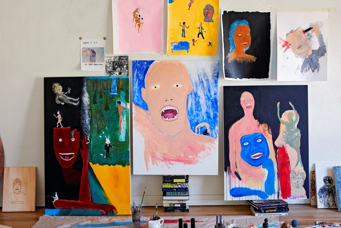 With the opening of his FA shop, Jason Dill has also released a book called Actual Visual Guidance, a 96-page book containing personal photos and collages that have been composed by Dill (bottom left image).
Visit Dill's FA store: fuckingawesomestore.com
More about Jason Dill: www.youtube.com/watch?v=ceIYzDr_ME8 |
AuthorHello! I am Isabel Martin and I am an art student at Maggie L. Walker Governor School. Archives
May 2021
Categories |


 RSS Feed
